In today’s hypercompetitive e-commerce landscape, knowing how to design a Shopify store that converts browsers into buyers is essential for survival. With over 4 million active stores on the platform, the difference between thriving and barely surviving often comes down to design choices that significantly impact your bottom line. According to TechRadar, Shopify’s market share grew by 21% in 2024, cementing its position as the go-to platform for businesses of all sizes.
The sobering reality is that nearly 70% of visitors will abandon your store due to poor design elements, confusing navigation, slow load times, or a complicated checkout process. “The bar for e-commerce design is constantly rising,” explains Sarah Chen, Director of User Experience at Conversion Kings. “What worked in 2023 barely meets minimum standards in 2025. Shoppers now expect an intuitive, frictionless experience.”
This comprehensive guide will walk you through designing a Shopify store that looks professional and converts, highlighting common mistakes to avoid.
Understanding the Foundations
In 2025, your Shopify store’s design directly impacts credibility and conversions. With 94% of first impressions tied to design and decisions made in under 50 milliseconds, poor layout, weak visuals, and lack of mobile optimization instantly kill trust. This Shopify store design guide will help you avoid those mistakes.
Mobile shoppers now dominate, making up 73% of e-commerce sales. A clunky mobile experience, slow load times, confusing navigation, and broken checkout can ruin conversions. Prioritize clean design, fast performance, and user-friendly structure to avoid costly errors and build instant credibility.
How to Design a Shopify Store for Beginners: Essentials
For newcomers to Shopify, the platform’s flexibility can feel overwhelming. The good news is that you don’t need a design degree or coding expertise to create a professional-looking store. According to Shopify, the most important first steps include:
- Define your brand identity: Before touching on a single design element, clarify your brand’s personality, values, and unique selling proposition.
- Research your target audience: Understanding your ideal customer’s preferences and behaviors should inform every design decision.
- Study your competitors: Analyze what’s working (and what’s not) in your niche to identify opportunities for differentiation.
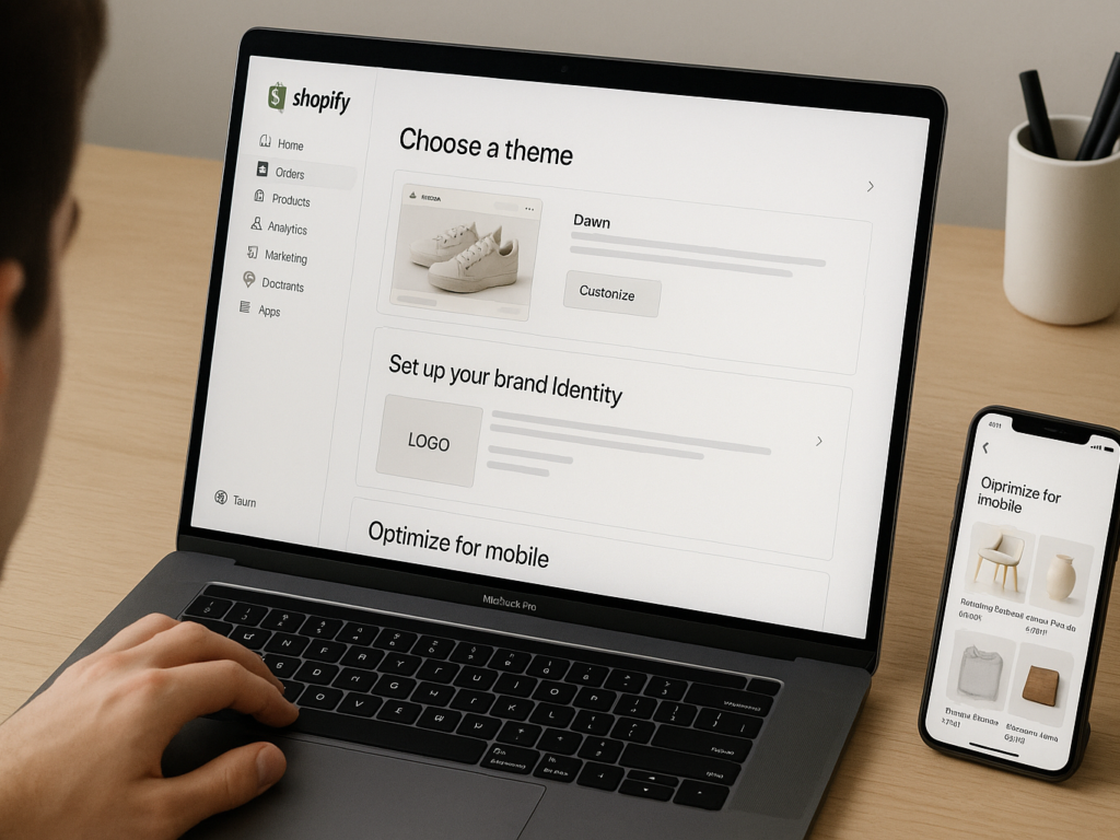
- Start with theme selection: Choose a theme that aligns with your products and industry rather than “looks cool.”
For absolute beginners, Shopify’s theme store offers a range of free and premium options that provide professional foundations without requiring design skills. Select a theme that aligns with your product category and business goals. Fashion retailers have different needs from those of B2B suppliers or digital product vendors.
“The biggest misconception I see with beginners is thinking they need a unique design from day one,” says Jason Fernandez, Shopify Partner and founder of Convert & Grow. “It’s far better to start with a proven theme structure and make strategic customizations than to attempt something completely custom before understanding core e-commerce principles.”
Step-by-Step Design Process
These practical steps will guide you through designing a Shopify store that looks polished, aligns with your brand, and drives conversions. From defining your visual identity to optimizing usability, each stage focuses on building a store that your customers will trust.
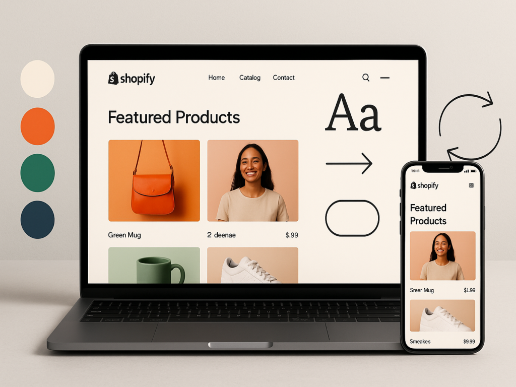
Step 1: Craft Your brand Style Guide
The foundation of any successful Shopify store isn’t found in flashy features or trending design elements; it starts with a clear, documented brand style guide. This crucial first step ensures visual consistency across your entire customer journey.
As revealed in Shopify’s retail report, brands with consistent presentation see an average revenue increase of 23%. Your style guide should include:
- Logo specifications: Primary and secondary versions, minimum sizes, and clear space requirements
- Color palette: Primary, secondary, and accent colors with exact HEX codes
- Typography: Header and body fonts with specific weights and sizing scale
- Image style: Guidelines for product photography, lifestyle images, and graphic elements
- Voice and tone: How your brand communicates through written content
“A style guide isn’t just about aesthetics; it’s about creating recognition and trust,” explains Maria Lopez, Creative Director at Shopify Plus agency Boulder Brands. “When elements like colors, fonts, and imagery remain consistent, customers subconsciously develop stronger connections with your brand.”
Even small inconsistencies can damage this trust. If your Instagram showcases bright, vibrant lifestyle images but your product pages feature flat, dull photography, that disconnect creates a cognitive dissonance that can trigger doubt in shoppers’ minds.
Before customizing your theme, establish these guidelines in a document your team can reference. This upfront investment will save countless hours of revisions and prevent the “design by committee” approach that leads to visual chaos.
Step 2: Choose & Customize Your Theme
Learning how to design a Shopify store often begins with theme selection, arguably one of the most consequential decisions you’ll make. Your theme is the architectural framework for your entire store, influencing everything from load speed to user experience.
According to the Shopify Help Center, themes fall into three categories:
- Free themes: Professionally designed, mobile-responsive options that offer core functionality
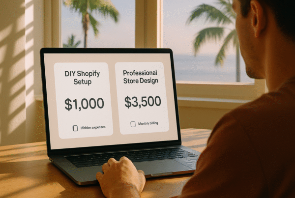
- Premium themes: More advanced features, industry-specific designs, and expanded customization options ($150-$350)
- Custom themes: Built-from-scratch solutions tailored precisely to your business needs ($5,000-$50,000+)
When evaluating themes, prioritize these factors:
- Page load speed: Themes with excessive animations and features often sacrifice performance
- Mobile responsiveness: Test how the theme adapts to different screen sizes
- Built-in features: Look for themes that include features you need without requiring additional apps
- Update frequency: Check when the theme was last updated; themes without recent updates may have compatibility issues
- Support quality: Read reviews about customer service response times and helpfulness
“The best theme isn’t necessarily the most feature-rich or visually impressive in demos,” warns Thomas Wright, Shopify Theme Developer with over 300 store builds. “It’s the one that provides the right foundation for your specific products and customer journey while maintaining excellent performance metrics.”
Once you’ve selected your theme, resist the urge to customize everything immediately. Instead, populate your store with actual products and content first, then make design modifications based on how your real content looks within the theme framework.
Step 3: Optimize Navigation & UX
The most beautiful Shopify store in the world will fail if customers can’t easily find what they’re looking for. In navigation design, aesthetics meet functionality, and stores win customers or lose them forever.
Research published by Webinopoly shows that 94% of consumers cite easy navigation as the most important website feature, yet only 28% of e-commerce sites meet customer expectations for navigation clarity.
When working on how to design a Shopify store that converts, follow these navigation principles:
- Implement the three-click rule: Customers should be able to find any product within three clicks
- Create logical category structures: Organize products in ways that match how customers think, not your internal systems
- Use descriptive labels: Avoid clever or ambiguous category names that might confuse shoppers
- Include a prominent search function: Place search bars in expected locations (typically top-center or top-right)
“Navigation isn’t about clever design; it’s about meeting expectations,” explains Ava Johnson, UX Researcher specializing in e-commerce. “When shoppers visit your store, they arrive with mental models from previous online shopping experiences. The more your navigation matches these expectations, the more cognitively fluent your site feels, and the more likely customers will convert.”
Smart navigation design extends beyond your main menu. Consider implementing breadcrumb navigation to help users track their location, and ensure your footer includes links to key pages like shipping information, return policies, and contact details.
Remember that mobile navigation requires special attention. Hamburger menus, though space-efficient, hide options from view. Consider supplementing with bottom navigation bars highlighting key categories or functions for mobile users.
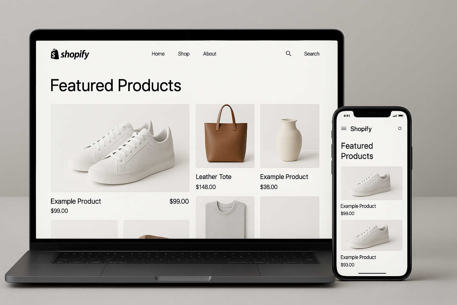
Step 4: High-Impact Product Pages
Product pages serve as the critical conversion point in your customer journey. According to Expert Talent Connections, visitors who reach product pages show high purchase intent, yet average conversion rates hover around 2.5%, indicating massive room for improvement through better design.
When focusing on how to design a Shopify store that drives sales, pay special attention to these product page elements:
- High-quality imagery: Include multiple angles, lifestyle contexts, and zoom functionality
- Video demonstrations: Products with videos see 37% higher conversion rates
- Clear, scannable descriptions: Use bullet points for key features and benefits
- Specifications: Include dimensions, materials, care instructions, and other relevant details
“Product pages should answer every possible question a customer might have before they need to ask it,” says Rebecca Chen, E-commerce Conversion Specialist. “Every unanswered question becomes a reason to leave your store and look elsewhere. Comprehensive product information doesn’t just boost conversions; it reduces returns and supports inquiries.”
Pay particular attention to your add-to-cart experience. Make buttons large and visible, and use contrasting colors that stand out from your site’s main color scheme. After adding items to the cart, provide clear feedback and next-step options that keep the shopping momentum going.
Finally, consider implementing a “quick view” functionality that allows shoppers to preview product details without leaving category pages, especially valuable for fashion, home goods, and gift stores where customers often browse multiple items.
Step 5: Checkout & Conversion Boosters
The painful truth of e-commerce: approximately 70% of shoppers who add products to their cart will abandon them before completing their purchase. Learning how to design a Shopify store that minimizes this abandonment is where significant revenue opportunities exist.
According to Omnisend, the primary reasons for cart abandonment include unexpected shipping costs (49%), having to create accounts (24%), and complicated checkout processes (18%), all factors directly influenced by design decisions.
Optimize your checkout flow with these proven strategies:
- Progress indicators: Show exactly where customers are in the checkout process
- Guest checkout option: Don’t force account creation before purchase
- Multiple payment options: Include credit cards, PayPal, Shop Pay, and emerging options like buy-now-pay-later services
- Trust signals: Display security badges, guarantees, and return policy reminders
Beyond the checkout itself, implement these conversion boosters throughout your store:
- Exit-intent popups: Offer incentives when visitors show signs of leaving
- Cart abandonment emails: Automatically follow up with reminders and incentives
- Cross-sells and upsells: Suggest complementary products at strategic moments
“The checkout page isn’t where you should express creative design freedom,” advises Marcus Wilson, Conversion Rate Optimization Specialist. “This is where clarity and efficiency must take absolute priority. Every unnecessary element or distraction costs you real money in abandoned carts.”
A well-designed checkout reduces friction while maintaining trust, a delicate balance that requires continuous testing and refinement based on your specific customer behavior.
Step 6: Integrations & Ongoing Optimization
Understanding how to design a Shopify store isn’t a one-time project. It’s an ongoing process of integration, testing, and optimization. The most successful stores continuously evolve based on data and changing customer expectations.
According to Shopify’s business reports, stores that regularly analyze and act on their data see 30-50% higher year-over-year growth than those that take a set-it-and-forget-it approach.
Essential integrations for a high-performing store include:
- Analytics tools: Beyond Shopify Analytics, consider Google Analytics 4 and heatmap tools like Hotjar
- Email marketing platforms: Integrate with services like Klaviyo or Omnisend for automated flows
- Reviews and UGC: Apps like Yotpo or Junip to build social proof
- Customer service tools: Live chat, help desk, and knowledge base solutions
- Loyalty programs: Reward systems that encourage repeat purchases
“The mistake I see most often is store owners adding every integration they can find without a clear purpose,” cautions Sophia Kim, Shopify App Developer. “Each integration adds code to your store, potentially impacting performance. Choose apps strategically based on data-identified needs, not FOMO.”
Establish a regular optimization schedule that includes the following:
- Monthly analysis of key metrics and user behavior
- Quarterly A/B testing of high-impact page elements
- Bi-annual review of the entire customer journey
- Annual competitive analysis and strategy refinement
Remember that optimization doesn’t always mean adding; sometimes, it means removing elements that create distraction or friction. The most successful stores often evolve toward greater simplicity over time, not increased complexity.
7 Common Shopify Design Mistakes to Avoid
Even experienced store owners frequently make design errors that silently damage their conversion rates. Recognizing these common Shopify design mistakes can help you avoid costly missteps in your store.
1. Ignoring Mobile Optimization
Despite mobile commerce dominating sales, many stores still treat mobile as an afterthought. According to Macarons & Mimosas, 57% of users won’t recommend businesses with poorly designed mobile sites, yet 23% of Shopify stores still fail basic mobile usability tests.
Mobile optimization goes beyond responsive layouts; it requires rethinking:
- Touch target sizes (buttons should be at least 44×44 pixels)
- Font sizes (minimum 16px for body text)
- Form designs (simplified for thumb navigation)
- Content hierarchy (what matters most on smaller screens)
“Mobile users aren’t just desktop users on smaller screens; they have different contexts, needs, and behaviors,” explains David Garcia, Mobile UX Consultant. “They often multitask, deal with distractions, and have less patience for friction.”
2. Overloading with Apps
The Shopify App Store offers incredible functionality, but excessive apps create bloat. Research from Webinopoly shows that each app added to your store increases average load time by approximately 200ms, with stores having 20+ apps often seeing 40-60% slower performance than those with 10 or fewer.
Be selective about app installations by:
- Auditing existing apps quarterly for usage and necessity
- Choosing apps from reputable developers with strong reviews
- Testing performance before and after installation
- Uninstalling unused apps completely (not just deactivating)
Remember that many features can be achieved through theme customization rather than adding separate apps, often with better performance outcomes.
3. Slow Page Load Times
Page speed might be the most underappreciated factor in e-commerce success. According to Omnisend, each additional second of load time decreases conversions by approximately 7%, with the most dramatic drops occurring between 0 and 3 seconds.
Common culprits behind slow Shopify stores include:
- Unoptimized images (wrong formats, excessive dimensions)
- Too many tracking scripts and pixels
- Heavy custom fonts
- Sliders and complex animations
- App code bloat
- Video backgrounds
One of the most crucial Shopify store design tips is prioritizing performance over visual complexity. Use tools like Google PageSpeed Insights and Shopify’s Online Store Speed report to identify specific improvements.
4. Poor Product Imagery
Product images directly influence purchase decisions, yet many stores cut corners here. Studies by Expert Talent Connections show that 83% of shoppers consider product images the most influential factor in purchasing decisions.
Image issues to avoid include:
- Inconsistent dimensions across products
- Poor lighting that misrepresents colors
- Limited angles that don’t show key features
- Low resolution that doesn’t support zoom functionality
- Stock photos that look generic or untrustworthy
“Great product photography doesn’t necessarily require expensive equipment,” notes Veronica Lee, E-commerce Photographer. “Even smartphone cameras can produce excellent results with proper lighting, background consistency, and attention to detail. The investment pays dividends in conversion rates and reduced returns.”
5. Cluttered Navigation
Navigation complexity correlates directly with abandonment rates. Research from Webinopoly indicates that sites with more than seven main navigation items see significantly higher bounce rates than those with 5-7 items.
Signs your navigation may be hurting conversions:
- More than seven top-level menu items
- Dropdown menus with more than 10 options
- Category names that use internal jargon
- Inconsistent naming conventions across pages
- Lack of search functionality or filters
Remember that effective navigation isn’t about showcasing everything; it’s about helping customers find exactly what they want with minimum effort.
6. Neglecting brand Consistency
Inconsistent branding creates cognitive dissonance that erodes trust. According to Shopify, consistent brand presentation increases revenue by up to 23%, yet many stores feature mismatched elements that confuse customers.
Common Shopify design mistakes related to branding include:
- Inconsistent color schemes across pages
- Multiple font families are used throughout the site
- Mismatched button styles and call-to-action formats
- Tonal shifts in copy (formal in some places, casual in others)
- Varying image styles between collections
“brand consistency creates a subconscious sense of reliability,” explains Emily Waters, brand Strategist. “When visual and verbal elements remain consistent, customers develop deeper trust in your business and products.”
7. Skipping User Testing
The most damaging mistake is failing to test designs with actual users. According to Shopify’s research, stores that conduct regular user testing see conversion rates approximately 15% higher than those that don’t.
You don’t need an elaborate testing lab; even simple approaches yield valuable insights:
- Session recording tools like Hotjar
- Five-second tests using services like UsabilityHub
- Asking friends or family to complete specific tasks
- Monitoring customer service inquiries for patterns
- Analyzing heatmaps of user interactions
When exploring how to design a Shopify store with AI tools, remember that artificial intelligence can analyze patterns but not replace human feedback about emotional responses to your design.
Advanced Tips: Leveraging AI in 2025
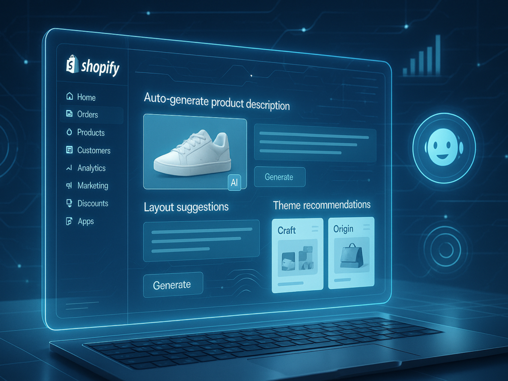
AI has transformed from a buzzword to an essential tool in Shopify design. Learning how to design a Shopify store with AI capabilities can dramatically improve your workflow efficiency and customer experience.
According to Reuters, Shopify’s integration of AI tools has reduced design time by up to 40% for merchants while improving conversion rates by an average of 11% through personalization.
Key AI applications for Shopify design in 2025 include:
- Theme recommendations: AI systems can analyze your products and target audience to suggest optimal themes
- Shopify Magic: Built-in AI tools that generate product descriptions, blog posts, and email content
- Layout optimization: AI analysis of user behavior to suggest optimal placement of elements
“AI in e-commerce isn’t replacing human creativity, it’s amplifying it,” says Dr. Marcus Chen, AI Integration Specialist. “The most successful stores use AI to handle data-driven decisions and repetitive tasks while focusing human effort on brand storytelling and emotional connections.”
When implementing AI tools, start with one application at a time, establish baseline metrics before implementation, and conduct A/B tests to verify improvements. Remember that AI requires quality data to perform effectively; garbage in and out applies even with sophisticated systems.
Conclusion & Key Takeaways
Mastering how to design a Shopify store means striking the right balance between aesthetics, usability, and psychology. In 2025’s hyper-competitive e-commerce landscape, even the smallest details, like a few milliseconds in load time or subtle visual trust cues, can dramatically impact performance and conversions.
The best-performing Shopify stores share several key traits: consistent and memorable branding, intuitive navigation built around customers’ thinking, and high-quality imagery that makes products shine. They also focus on frictionless checkout flows, mobile-first experiences that reflect modern browsing habits, and ongoing refinement based on real user behavior and data insights.
By following this Shopify store design guide and steering clear of common design pitfalls, you won’t just build a digital storefront. You’ll create a seamless, trust-building experience that turns visitors into loyal buyers. And remember: your store isn’t a static project. Treat it as a living, evolving entity that needs constant updates to stay relevant and effective.
FAQs on How to design a Shopify store
Q1: How much does a professional Shopify store design cost?
Professional Shopify design costs vary widely from $150-$350 for premium themes to $5,000-$50,000+ for custom builds. Most small businesses succeed with premium themes under $300 plus strategic customizations.
Q2: How long does it take to design a Shopify store?
A basic Shopify store can launch in 1-2 weeks. Complex stores with custom features typically take 4-8 weeks. The most time-consuming aspects are content creation and product setup, not technical implementation.
Q3: Can I design a Shopify store without coding knowledge?
Absolutely! Shopify’s theme customizer allows non-technical users to create professional stores without coding. Use Shopify’s app ecosystem for advanced customizations or hire developers for specific features.
Q4: What’s the biggest design mistake Shopify store owners make?
Neglecting mobile optimization is the most costly mistake. With 73% of e-commerce happening on mobile devices, prioritize thumb-friendly navigation, readable fonts, and touch-optimized product pages.
Q5: How many apps should I install on my Shopify store?
Limit your store to 10-15 essential apps. Each additional app slows your site by approximately 200ms, directly impacting conversion rates. Focus on quality over quantity.